Three library fonts on packaging, merch, and a subway billboard, plus what to expect when you bring your own.
Short answerTo use a specific font in AI images, pick the font instead of describing it. In Recraft Studio, open the Font library from the + button next to your prompt, choose a typeface or upload your own, put your text in quotes, and Recraft generates the image with the lettering in that font. It works best on short text: a name, a headline, a slogan.
Key takeaways
Describing a typeface in words, like "heavy condensed sans," leaves the model to fill the gap with its own guess.
The Font library in Recraft Studio lets you pick a typeface by name, filter by vibe, appearance, and type, or upload your own font.
Generated lettering earns its place where text sits on an object: packaging, merch, signage, and billboards in perspective.
Short text works best, while long copy, prices, and legal lines still belong in a text layer you set yourself.
The lettering is generated, not typeset, so expect small differences from the original font and proofread every word.
Why describing a font in a prompt falls short
A typeface is specific in a way a description isn't. "Heavy condensed sans, slightly rounded" fits dozens of fonts, and each one gives a headline a different voice. Write that into a prompt, and the model settles on its own reading of it. You find out which one only when the image is done.
Naming the font helps only if the model already knows that typeface well. So the usual fallback is to generate the image without text and set the type afterward in a design tool. That works for a flat poster. It works much less well when the words have to wrap around a tube, sit in the weave of a T-shirt, or recede at an angle across a billboard.
How to use a specific font in AI images with Recraft Studio
The Font library replaces the description with the font itself: you pick a typeface, and Recraft generates the image with the lettering in it.
Click + next to your prompt, in Create or in Chat, and choose Font.
Find a typeface. Search by name, or filter by Vibe, Appearance, and Type. Fonts you upload live in the Uploaded tab, and favorites in Saved.
Type your own words on a font card to preview them, then click Apply. The font appears next to your prompt as an Aa tile.
Write the prompt with the text in quotes, for example: a vintage coffee shop poster that says "Morning Ritual".
Generate.
The font works in Edit image too, so you can bring it into a picture you already have. Recipes and History keep the prompt and the font tile together, so a good result is easy to run again.
Where a picked font earns its place
Generated lettering matters most where the text belongs to the scene instead of sitting on top of it. Three examples, each with a font from the library.
Packaging: one name across a product line
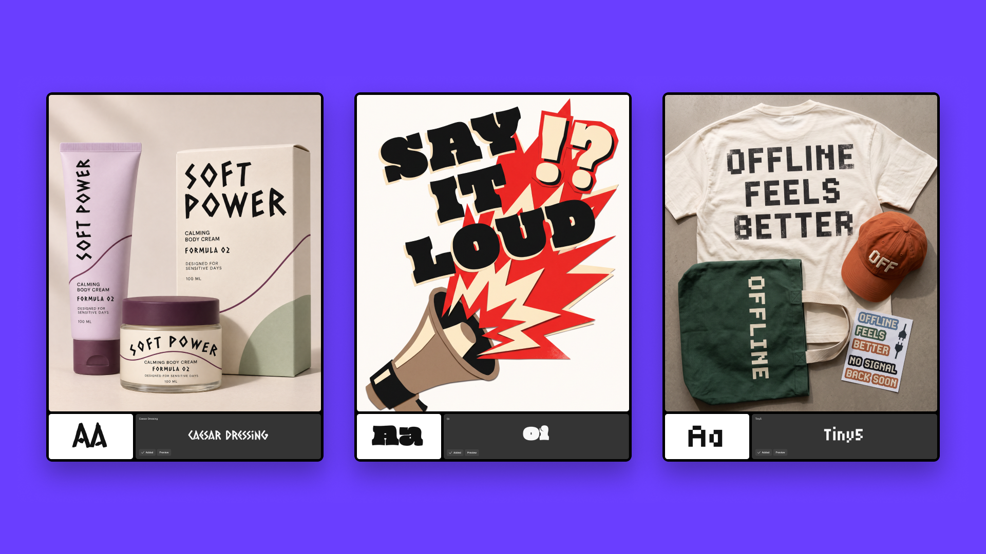
A body cream called Soft Power, set in Caesar Dressing, runs up the side of a squeeze tube, across a jar label, and over the front of a carton. One prompt shows the whole range in the brand's type. That's the view you want before anyone draws a dieline.
Merch: the same line on cotton, canvas, and a cap
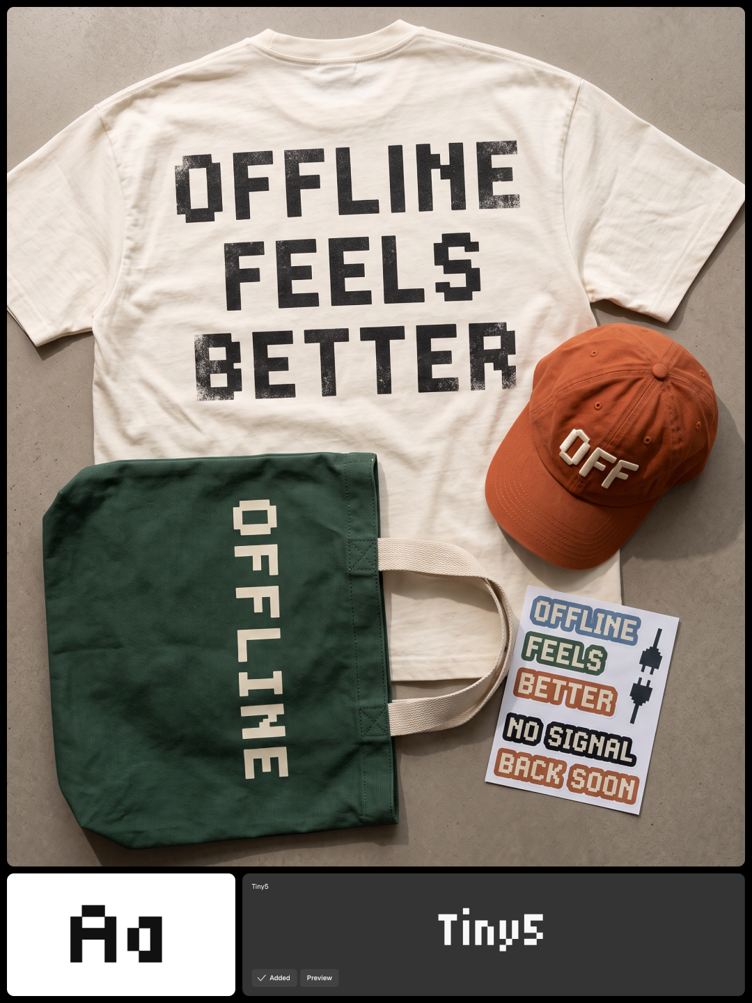
"Offline Feels Better" in Tiny5, a pixel font, sits across a T-shirt, down a tote, and on a cap, with a sticker sheet beside them. The type picks up the texture of each material, which a flat overlay can't. It's a quick way to show a client a drop before samples are ordered.
Out-of-home: type in perspective
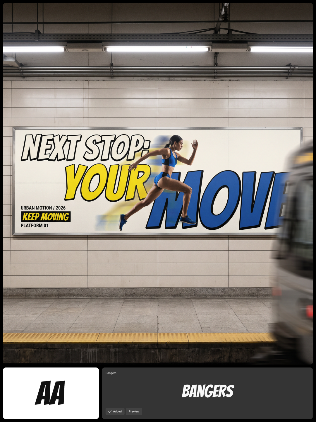
"Next Stop: Your Move" in Bangers fills a backlit billboard across subway tracks, seen from the platform at an angle while a train blurs past. The headline takes on the scene's perspective and light. Use it to pitch a campaign in context, before the media buy.
The same approach covers posters, book and album covers, and video thumbnails, anywhere the image and the headline are designed together.
Using your own font
Upload a font in the Uploaded tab, and it sits next to the library fonts. For brand teams, this is the main reason to use the feature: product shots, campaign visuals, and social graphics come out with lettering in the brand's own typeface instead of a stand-in.
Two checks before you start. Make sure your font license covers this kind of use. If your text has accented or non-Latin characters, make sure the font file includes them.
What to expect, and when to use a text layer instead
The lettering is generated, not typeset. Small differences from the original font can happen, especially in spacing and fine details, so proofread every word. The text is part of the image, so you can't edit it later like a text layer.
Text
Better as
A name, headline, or slogan on an object
Generated lettering, Font library
Lettering on fabric, glass, light, or in perspective
Try the Font library in Recraft Studio: pick a font, quote your headline, and see where it lands.
FAQs
Can I use my own font in an AI image generator?
In Recraft Studio, yes. Upload the font in the Uploaded tab of the Font library, apply it, and put your text in quotes in the prompt. Recraft generates the image with the lettering in that font.
Will the text match the font exactly?
Close, but not always identical. The lettering is generated rather than typeset, so small differences in spacing or detail can happen. Proofread every word before you use the image.
Can I edit the text after the image is generated?
Not as text. The lettering is part of the image, so to change a word you generate again or use Edit image. For copy that may change, add a text layer with the Text tool instead.
How much text can I put in an image with a font?
Short text works best: a name, a headline, or a slogan. Long copy, prices, and legal lines are better set as a text layer.