Ideogram V4 earned its reputation on type, and it earned it honestly. Ask for a poster headline and you get one that is set, not drawn.
This comparison asks a different question. Not which image looks better in a feed, but which one survives the next step: the export, the handoff, the palette change, the second frame. Seven prompts, two models, Recraft V4.1 on the left of every pair.
A clean, two-color logo
Recraft V4.1
.png)
Ideogram 4
PROMPT (click to expand)
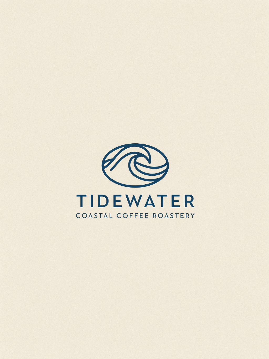
Flat vector logo for a coastal coffee roastery called Tidewater. A wave curve forming a coffee bean silhouette. Two colors, no gradients, generous negative space.
Ideogram returned a circular badge: a wave inside a ring, a lighter weight of type, a second line of copy underneath. It looks like the label on a good tin of something.
V4.1 went flatter. One blue wave, one typeface, nothing else. That matters at the size logos actually live at, where a ring with an interior line fills in and a two-color mark stays readable. V4.1 also returns it as vector, so the paths open in Figma and the blue becomes the client's blue without a repaint.
An icon set that reads as one set
Recraft V4.1
.png)
Ideogram 4
PROMPT (click to expand)
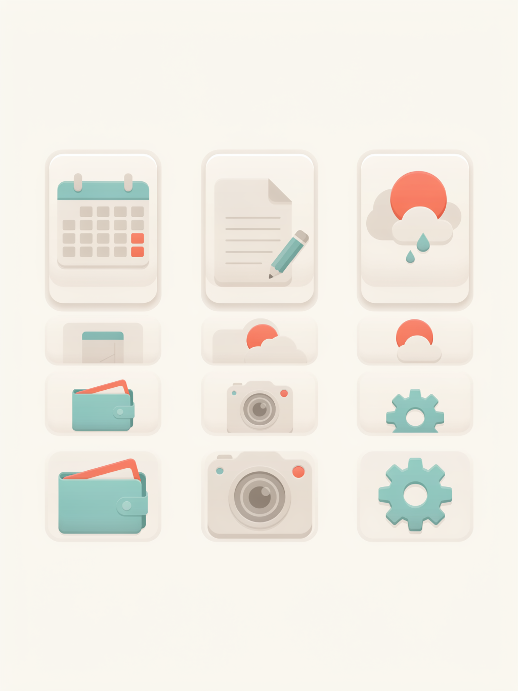
Six app icons in one system: calendar, notes, weather, wallet, camera, settings. Rounded square, subtle depth, identical perspective and light source.
Eight icons for one product.
Ideogram's nine tiles are appealing one at a time. Seen as a grid, the palette and the treatment shift from tile to tile, so the set reads as a mood board rather than a system.
V4.1 held one material, one light source, and one corner radius across all eight. That is the least interesting part of the job, and it is the part that decides whether the set ships or goes back out to a designer.
A poster with small type
Recraft V4.1
.png)
Ideogram 4
PROMPT (click to expand)
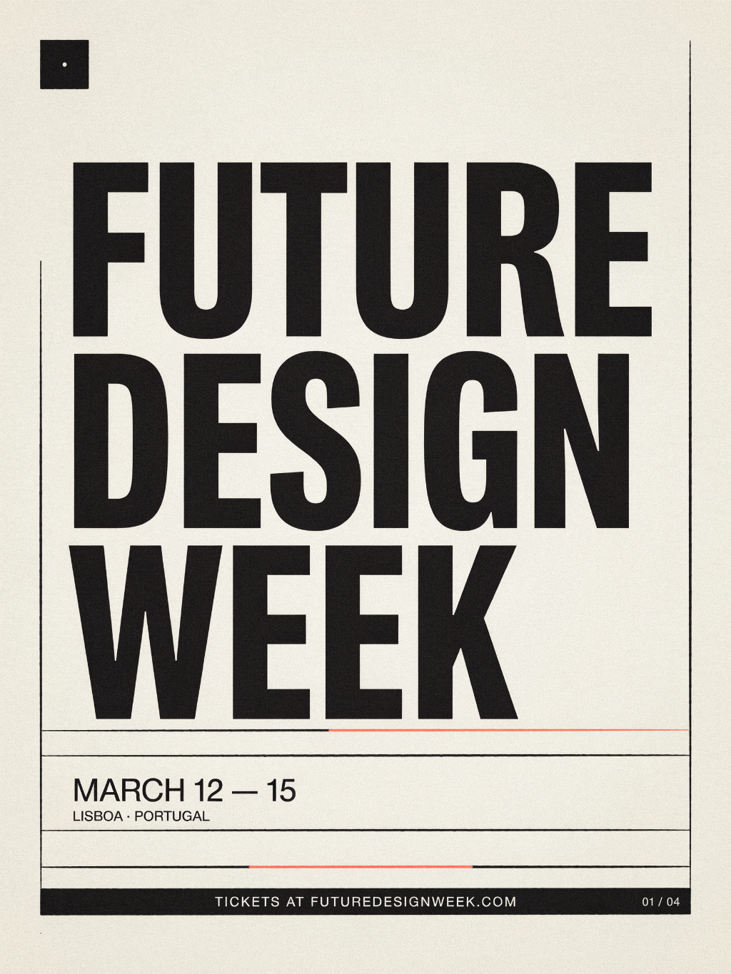
Event poster. Headline: FUTURE DESIGN WEEK. Subhead: March 12 to 15, Lisbon. Footer: tickets at futuredesignweek.com. Swiss grid layout, high contrast, bold sans serif.
This is Ideogram's lane, and the headline confirms it. FUTURE DESIGN WEEK sets cleanly on both sides, tight tracking, no merged letterforms.
Recraft V4.1 went more artistic, providing more color and depth.
Both created something beautiful and usable.
A flat illustration you can recolor
Recraft V4.1
.png)
Ideogram 4
PROMPT (click to expand)
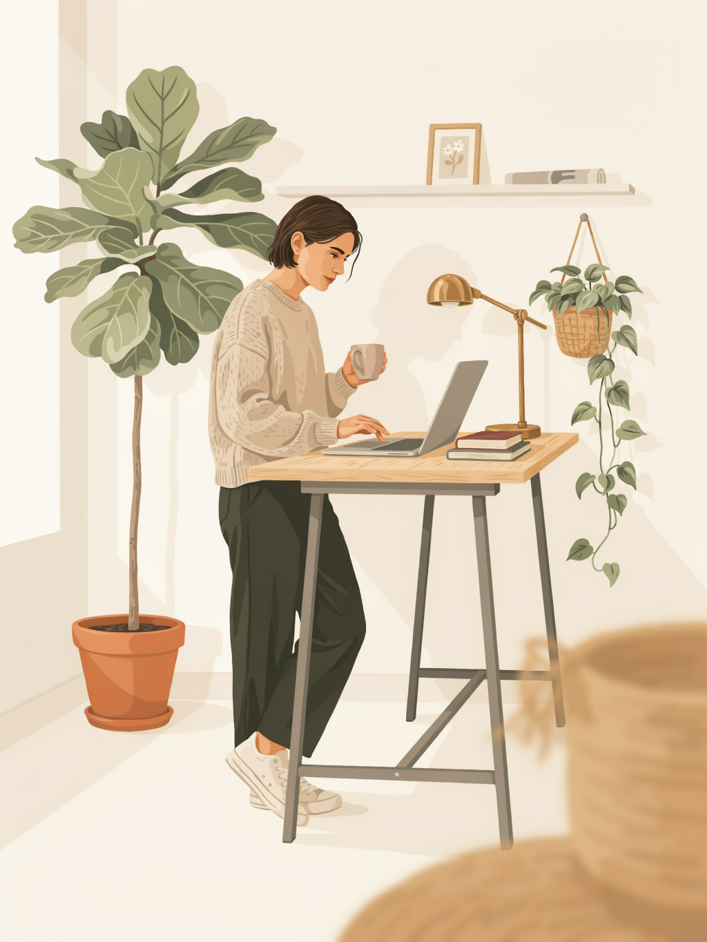
A brand illustration matching the uploaded reference image. Subject: a person at a standing desk with a laptop and two plants.
Same subject on both sides: someone working at a desk, a plant, a laptop.
Ideogram's is softer and hand-textured, and it is the warmer picture of the two. It is also a picture. Change the brand palette and you are regenerating, not editing.
V4.1's is flat vector. Five colors, closed shapes, editable paths. Swap the palette, move the plant, scale it to a hero without it turning to mush.
A quiet product shot
Recraft V4.1
.png)
Ideogram 4

PROMPT (click to expand)
A brand illustration matching the uploaded reference image. Subject: a person at a standing desk with a laptop and two plants.
Ideogram's is the moodier photograph: deep navy label, ornate crest, warm wood underneath. If the deliverable is one hero image, it is right there.
V4.1 put a plain can on a wet rock in flat daylight. It looks like packaging that exists rather than packaging that was illustrated, which is the version you can place next to a real photograph of the product without the two arguing.
The same woman, café to street
Recraft V4.1
.png)
Ideogram 4

PROMPT (click to expand)
The same woman with short curly red hair and round glasses, shown in three scenes: reading on a train, ordering coffee, walking a dog at dusk.
One character, cream suit, an interior frame and an exterior frame.
Both models keep a face recognizable between shots. The difference is what happens around her. V4.1 moved the same woman from a café table to a sidewalk with the wardrobe intact and the light changing the way light changes when you step outside, so the two frames read as one shoot. Ideogram showed her in different clothes, on different days, and labeled each photo.
A portrait with something happening in the frame
Recraft V4.1
.png)
Ideogram 4

PROMPT (click to expand)
A man in his fifties with a shaved head and salt-and-pepper beard sitting in a diner booth, hands wrapped around a coffee mug, looking out the window. Morning light through glass, 35mm, shallow depth of field.
An older man at a table by a window.
Ideogram's is a good photograph of a man sitting. The window light is doing real work and the face holds up at full size.
V4.1 gave him something to do. He is writing, the notebook is open, the hands are occupied, and the frame has a reason to exist beyond proving the model can render a face. That is the difference between a portrait and a still from something.
If you are shopping for an Ideogram alternative
Use Ideogram V4 when the deliverable is the image and the type is the point. It is good at that, and pretending otherwise would not help you.
Use Recraft V4.1 when the image is the beginning of the work: when the logo has to become an SVG, the icons have to match each other, the illustration has to take a new palette, and the woman in the cream suit has to show up in five more frames on Monday.
Try it free at recraft.ai
.svg)