The moment your product needs its own visual language, something that reads as one set across every button, menu, and empty state, off-the-shelf stops being enough.
This tutorial covers the full process: how to define a style, build on a grid, keep a set consistent as it grows, and what formats and sizes to export. Where AI fits in, too.
What makes a good icon
An icon communicates a single idea at a small size. It has to work at 16x16 pixels and still look right at 48. That constraint shapes everything about how icon design works.
Good icons share three properties:
Clarity. The concept reads without a label at the intended display size.
Consistency. Every icon in the set looks like it came from the same hand.
Scalability. The shape holds up in vector form and doesn't rely on details that disappear when scaled down.
Before you start drawing, decide on the visual language: filled or outlined, rounded or geometric, playful or precise. That decision determines every icon you make.
Step 1: Define your icon style
The first decision is style. Everything else follows from it.
Common approaches:
Outline icons: line-only shapes with no fill. Clean, modern, and common in product UI (think navigation bars).
Filled icons: solid shapes with higher contrast, easier to read at small sizes.
Duotone icons: two tones, usually a primary shape with a lighter secondary layer. Popular for marketing and feature sections.
Flat icons: minimal detail, solid colors, no gradients or shadows. Versatile and easy to keep consistent.
Pick one. Mixing styles in the same set almost always reads as unfinished.
Step 2: Set up your icon grid
Every professional icon set is built on a grid. The grid determines the bounding box each icon lives in, the optical margins, and how much of the space the icon can occupy.
A standard setup:
Canvas size: 24x24px is the most common for UI icons, but 16x16 is for small contexts (favicons, badges)
Live area: the region where your icon shape sits, typically 20x20 inside a 24x24 canvas (2px margin on each side)
Optical padding: leave a small breathing gap so icons don't crowd their containers
The grid is not decorative. It is what makes icons from different files look like they belong together when you're done.
Step 3: Establish your design rules
Before you create the first icon, write down the rules that will apply to all of them. Three numbers matter most:
Stroke width. If you're drawing outline icons, every stroke should be the same weight. 1.5px is common for 24px icons; 2px for bolder styles. Mixing weights makes a set look unfinished.
Corner radius. Rounded corners or sharp? Pick one and apply it everywhere. A corner radius of 2px is a common middle ground, softer than zero and less playful than 4px.
End caps. For stroked icons, decide whether line ends are square (butt), rounded, or capped. Round is warmer; square is more precise. Either works. Mixing doesn't.
Document these decisions. You will need to reference them for every icon you add to the set.
Step 4: Create your icons
With the style and rules set, you can start creating.
Option A: Draw from scratch in a vector toolFigma, Illustrator, and Sketch all support the grid-based workflow above. Draw each icon inside its 24x24 frame using the rules you defined.
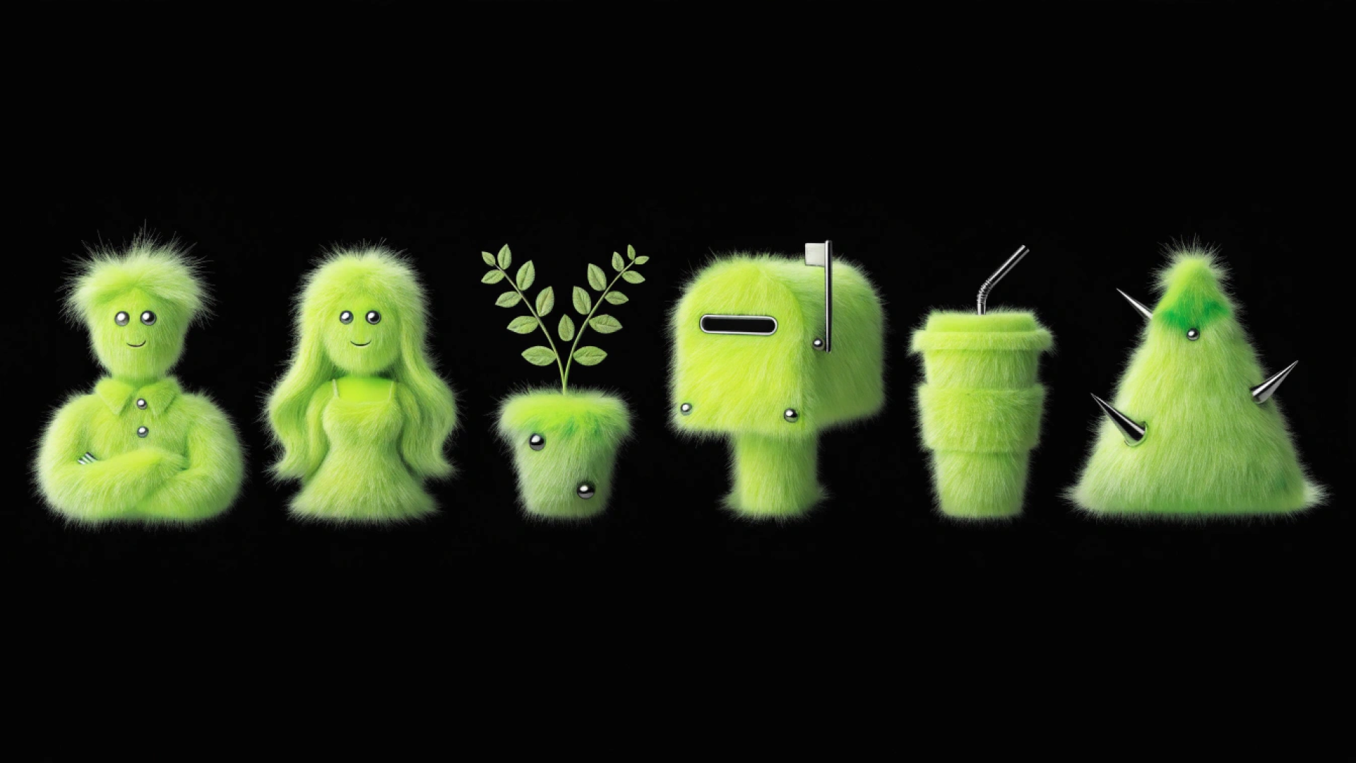
Option B: Generate icons with AI, then refineAI makes the first pass faster. Recraft's AI icon generator produces icon sets in a consistent visual style directly from a text prompt. You can specify the style (outline, filled, flat), the mood, and the color palette, then generate an entire set in one pass rather than drawing each icon individually.
The output comes as clean SVG, which you can open in Figma or Illustrator to adjust shapes, verify stroke weights, and match your grid.
For teams that need feature icons, empty states, and illustration systems all at once, generating the first draft takes minutes rather than days. The stroke weight, corner radius, and style you defined in Step 3 go directly into the prompt.
Step 5: Keep the set consistent
This is where most icon sets fall apart. Individual icons look fine; the set looks inconsistent.
Run these checks across every icon before you finalize:
Visual weight. All icons should occupy a similar amount of space in the live area. A thin arrow next to a heavy document icon breaks the rhythm. Adjust until the perceived weight is even.
Detail level. If one icon has four details and another has one, they don't look like siblings. Simplify the complex icons or add enough to the sparse ones to balance them.
Metaphor consistency. Decide on canonical representations for common concepts and stick to them. If "home" is a house shape, every icon that references home uses that shape. Never two versions of the same concept in the same set.
Optical alignment. Icons that look centered on the grid often aren't truly centered. Round shapes appear smaller than square shapes of the same dimensions. Adjust optically, not mathematically.
Recraft's AI vector generator can help here: generate alternate versions of icons where the weight or shape isn't landing, then pick the one that holds the line with the rest of the set.
Step 6: Test at size
Every icon needs to be tested at its actual display size, not the artboard size.
Zoom out to 100% (or the target display resolution) and look at the full set. Common issues that only appear at size:
Thin strokes disappear at small sizes
Complex details merge into blobs
Corner radii that look right at 24x24 are too large at 16x16
If an icon breaks at the size it will actually be used, simplify it.
Step 7: Export for production
Icons need to be available in multiple formats and sizes depending on where they're used.
SVG is the primary format for web and app UI. It scales to any size without quality loss, stays small in file size, and is editable in code. Always export icons as SVG for UI use.
PNG is needed for contexts that don't support SVG, including some email clients, certain app stores, and raster-only environments. Export PNG at:
1x: the base display size (e.g. 24x24px)
2x: for retina/high-density displays (e.g. 48x48px)
3x: for the highest-density mobile displays (e.g. 72x72px)
Favicon sizes require specific dimensions:
16x16: browser tab, classic favicon
32x32: taskbar and bookmark icons
180x180: Apple Touch Icon (iOS home screen)
192x192: Android home screen shortcut
App icon sizes for stores and platforms:
1024x1024: iOS App Store submission
512x512: Google Play Store and base size for Android adaptive icons
Name files consistently: icon-name.svg, icon-name@2x.png, icon-name@3x.png. Consistent naming prevents errors when developers pull assets into code.
How to keep the set consistent over time
Icon sets grow. New features need new icons, new products add new concepts, and the set that was 12 icons becomes 80. The ones that hold together at 80 were designed with rules written down from the start.
Write a brief style guide. Document the grid, stroke width, corner radius, and end cap style. Even a single shared Figma page does the job. Without it, the 40th icon will be designed from memory, and memory drifts.
Use a master frame. Keep all icons in one Figma file at the same frame size. New icons go there first, before they go anywhere else. Seeing them all in one place is how you catch the one that doesn't belong.
Generate in batches. When you need five new icons for a feature, generate them together, not one at a time. Designing in a group makes inconsistencies visible immediately. An icon that looks fine in isolation often doesn't match the others when placed next to them.
Audit periodically. Set a reminder to review the full set once a quarter. Look for icons that have drifted in style, duplicates of the same concept, or icons for features that no longer exist.
FAQs
How do I create custom icons for my app or website?
Start by defining a visual style (outline, filled, flat, or duotone) and a set of design rules: canvas size, stroke width, corner radius, and end caps. Then create each icon inside a consistent grid (24x24px is standard for UI). Export as SVG for web use and PNG at 1x, 2x, and 3x for raster contexts. For apps, you'll also need platform-specific sizes: 1024x1024 for the iOS App Store and 512x512 for Google Play.
What is the standard size for custom icons?
The most common size for UI icons is 24x24px, with a 20x20px live area inside a 2px margin on each side. For favicons, you need 16x16, 32x32, and 180x180 (Apple Touch Icon). App store icons require 1024x1024 (iOS) and 512x512 (Android). Always export SVG for scalable use and PNG at multiple resolutions for raster environments.
What format should I use for custom icons: SVG or PNG?
SVG for almost everything. It scales without quality loss, stays small, and is editable in code. Use PNG when the target environment doesn't support SVG, such as some email clients, older platforms, or services that require raster input. For those cases, export at 1x, 2x, and 3x so the icon looks sharp on high-density screens.
What is the difference between outline icons and filled icons?
Outline icons use line shapes only, with no fill. They're common in navigation and toolbar contexts and read as clean and modern. Filled icons use solid shapes with higher contrast, making them easier to read at very small sizes. The choice is primarily visual: pick the style that fits the product and apply it consistently across the entire set.
Do I need a favicon if I have a custom icon?
A favicon is a browser-specific icon format, separate from your UI icon set. It's the small image that appears in the browser tab, bookmark bar, and browser history. You need a favicon for any website. The minimum size is 16x16px; 32x32 is also commonly required. For iOS, a 180x180px Apple Touch Icon is used when someone adds your site to their home screen.
.svg)

.png)
.png)
.png)
.png)
.png)
.png)
.png)