Not every comparison is a fight. Some are just a good look at two genuinely different tools doing what they do best.
Recraft V4.1 is built around design intelligence and aesthetic instinct. It's a model that brings a point of view to every output with its art direction, compositional judgment, and the kind of visual taste that makes a result feel considered rather than generated.
ImagineArt 2.0 comes at it from another angle entirely: true-to-life photographic precision, cinematic lighting, and a realism score that makes some outputs genuinely hard to distinguish from photographs.
Different philosophies. Different strengths. Worth knowing the difference before you pick a tool.
We ran both models through eight prompts spanning portraiture, logo design, illustration, typography, and mixed-media work. Each prompt was chosen to stress-test a specific creative capability. Here's what we found.
Case 1: Editorial lifestyle portrait
Recraft V4 Pro
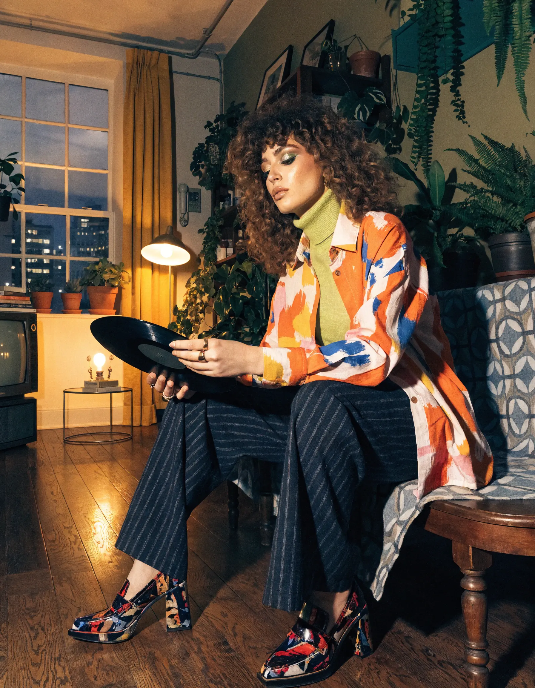
ImagineArt 2.0
.webp)
PROMPT
Fashionable girl holding a vinyl record inside a retro apartment with large windows and plants, cozy evening scene
Recraft V4.1 read "fashionable" and "retro" as an invitation. The result is fully committed to a vibe: bold mixed-print styling, statement shoes, a cozy apartment that looks genuinely lived in, and warm lamplight that feels like it was art directed, not rendered. The model made real choices here. The patterned overshirt, the glam eye makeup, and the scattered plants catching the glow all coheres into something you could pull straight from an editorial shoot.
ImagineArt 2.0 went quieter and more grounded. The subject is styled in a subtler palette, the apartment has a warm, woody stillness to it, and the light coming through the window has that particular blue-hour quality that photographers chase. Where Recraft gave you a mood board, ImagineArt gave you a photograph. The vinyl record even has a legible label.
Verdict: Two very different creative reads on the same prompt. Recraft V4.1 brings the art direction to be used when you want something with personality and visual intention. ImagineArt 2.0 brings the photographic credibility to be used when the image needs to feel real.
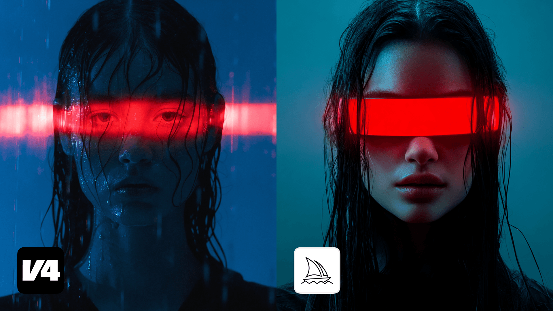
Case 2: Sci-fi portrait
Recraft V4 Pro

ImagineArt 2.0
.webp)
PROMPT
Stylish alien girl with sharp eyeliner and futuristic accessories, close-up portrait, confident expression
Recraft V4.1 committed to the sci-fi of the brief completely. Pointed ears, iridescent visor, holographic light refractions, sculptural neck rings, and braided pearl details all points to an otherworldly vibe. The whole image reads like a beauty editorial from a planet with better fashion weeks than ours. Recraft made creative decisions the prompt only hinted at.
ImagineArt 2.0 delivered a portrait that is technically immaculate. The skin texture, the eye detail, the subtle futuristic collar is all sharp and convincing. But "alien" got interpreted as "human with good cheekbones." The confidence in the expression absolutely kills here, and the realism is undeniable. It just didn't take a large sci-fi leap.
Verdict: Depends entirely on what you need. Recraft V4.1 is the pick when the brief has creative range and you want the model to run with it. ImagineArt 2.0 is the pick when the output needs to feel like a photograph first, concept second.
Case 3: Cinematic Movie Poster
Recraft V4 Pro
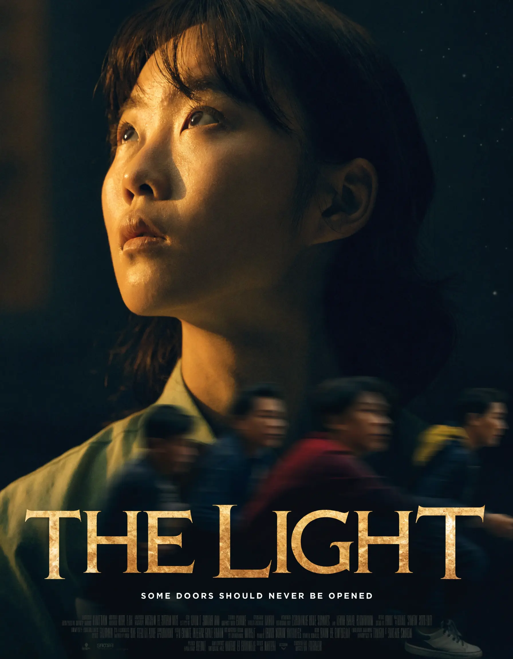
ImagineArt 2.0
.webp)
PROMPT
Cinematic movie poster
Recraft V4.1 delivered something that looks like it was pulled from a movie festival lineup. "The Light" has a real poster's anatomy: a compelling lead subject lit with genuine cinematic weight, motion-blurred crowd in the background creating narrative tension, and a tagline. The typography is clean, legible, and correctly placed. You could print this.
ImagineArt 2.0 got the cinematic atmosphere right, and the dramatic sunset silhouette has real visual impact. But the text is where it falls apart. The title is garbled, and the cast billing is gibberish. The bones of a great poster are there. The execution isn't print-ready.
Verdict: Atmosphere is only half the job on a movie poster. Text rendering and compositional control are the other half, and "The Light" delivers on both. ImagineArt 2.0 shows what it can do with mood and light, but readable type remains a meaningful gap.
Case 4: Fashion
Recraft V4 Pro
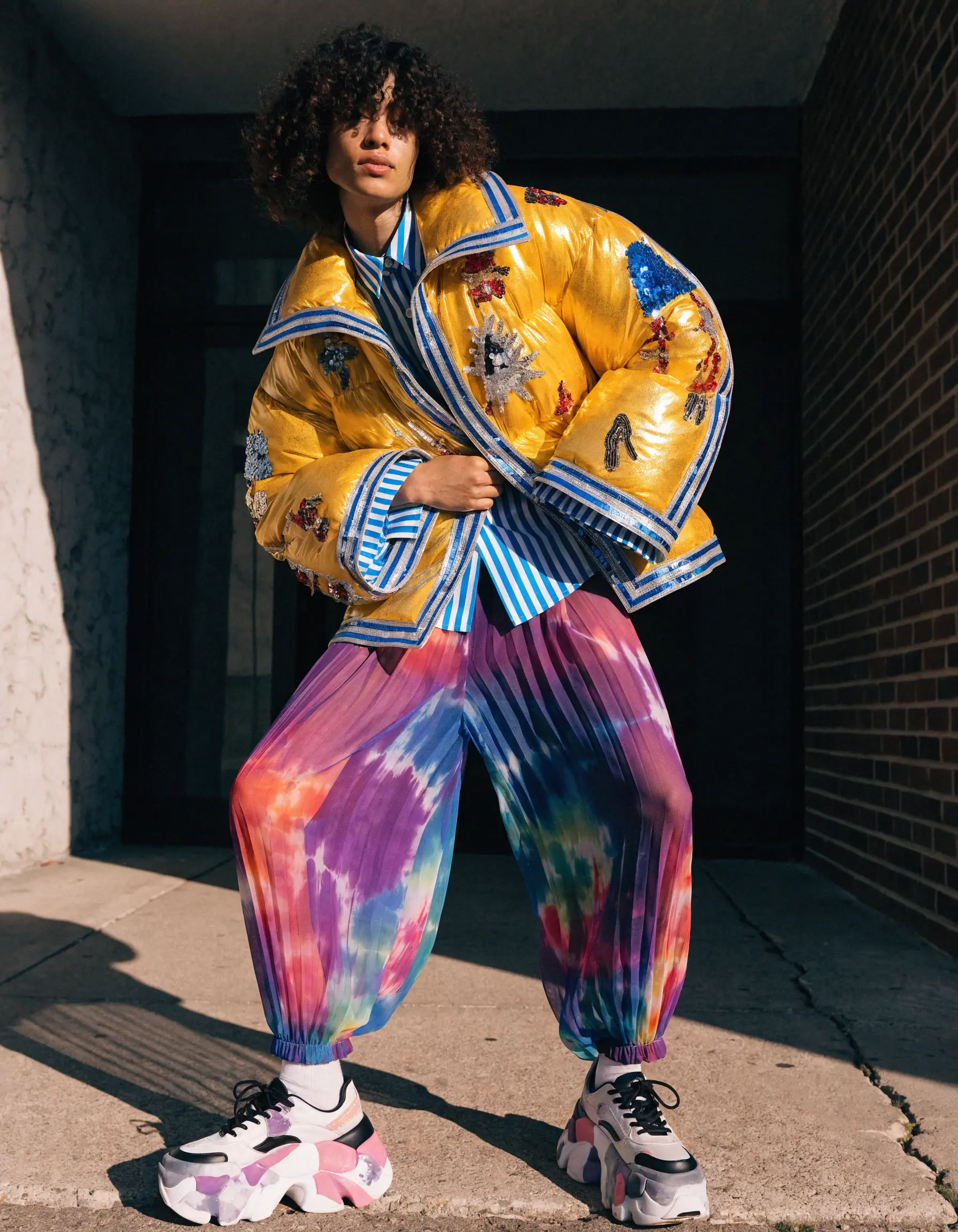
ImagineArt 2.0
.webp)
Recraft V4.1 interpreted "fashion" as a creative statement. Bold yellow embroidered bomber, tie-dye harem pants, chunky sneakers, shot on a street corner with the kind of casual confidence that makes it feel like a real editorial. It has a point of view. Someone made choices here, and they were interesting ones.
ImagineArt 2.0 interpreted "fashion" as product. The emerald satin gown is beautifully rendered. The fabric drape, light on the material, and clean neutral backdrop looks like a real photo you'd see on a product page. It's technically accomplished and commercially useful.
Verdict: Neither is wrong, they just answer different questions. Recraft V4.1 is the pick for editorial work or anything where fashion needs a personality, like in fashion magazines. ImagineArt 2.0 is the pick when the clothes are the subject and the shot needs to be clean, controlled, and conversion-ready, like on product pages.
Case 5: Emotional portrait
Recraft V4 Pro
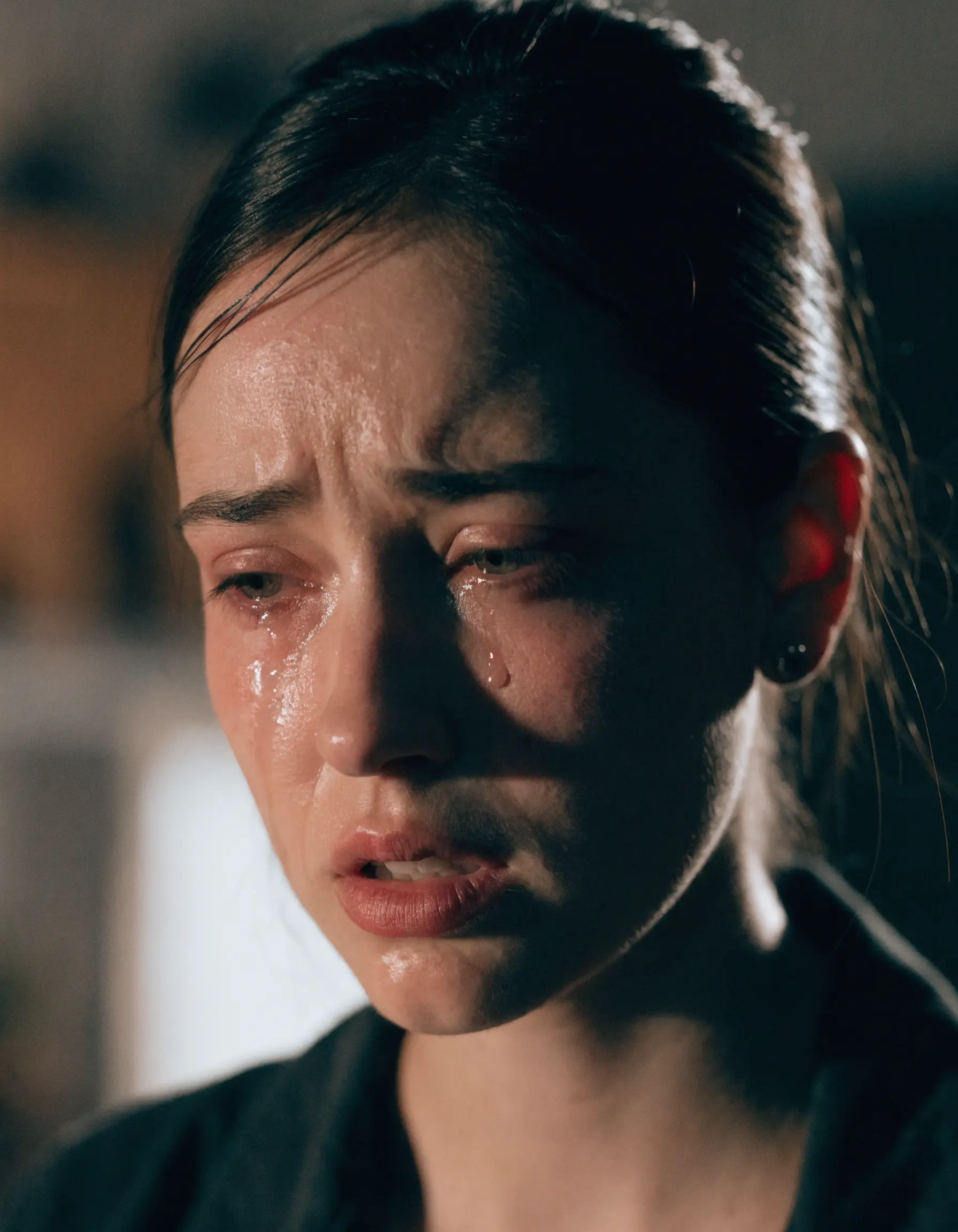
ImagineArt 2.0
.webp)
PROMPT
Crying woman cinematic close-up
Recraft V4.1 went full cinema. The tears catch the light beautifully, and the expression lands somewhere between devastated and composed, which is exactly how people cry in films. It's emotionally resonant and visually polished. This belongs in a drama series trailer.
ImagineArt 2.0 did something braver. The subject has redness around the eyes, visible skin texture, the kind of face that's been crying for a while rather than just starting to. There's nothing glamorous about it, and that's the point. It's the kind of image that makes you feel something precisely because it doesn't try to be beautiful.
Verdict: Recraft V4.1 gives you the cinematic version of emotion. ImagineArt 2.0 gives you the human one. Both are strong, and the right choice depends entirely on what the image is for.
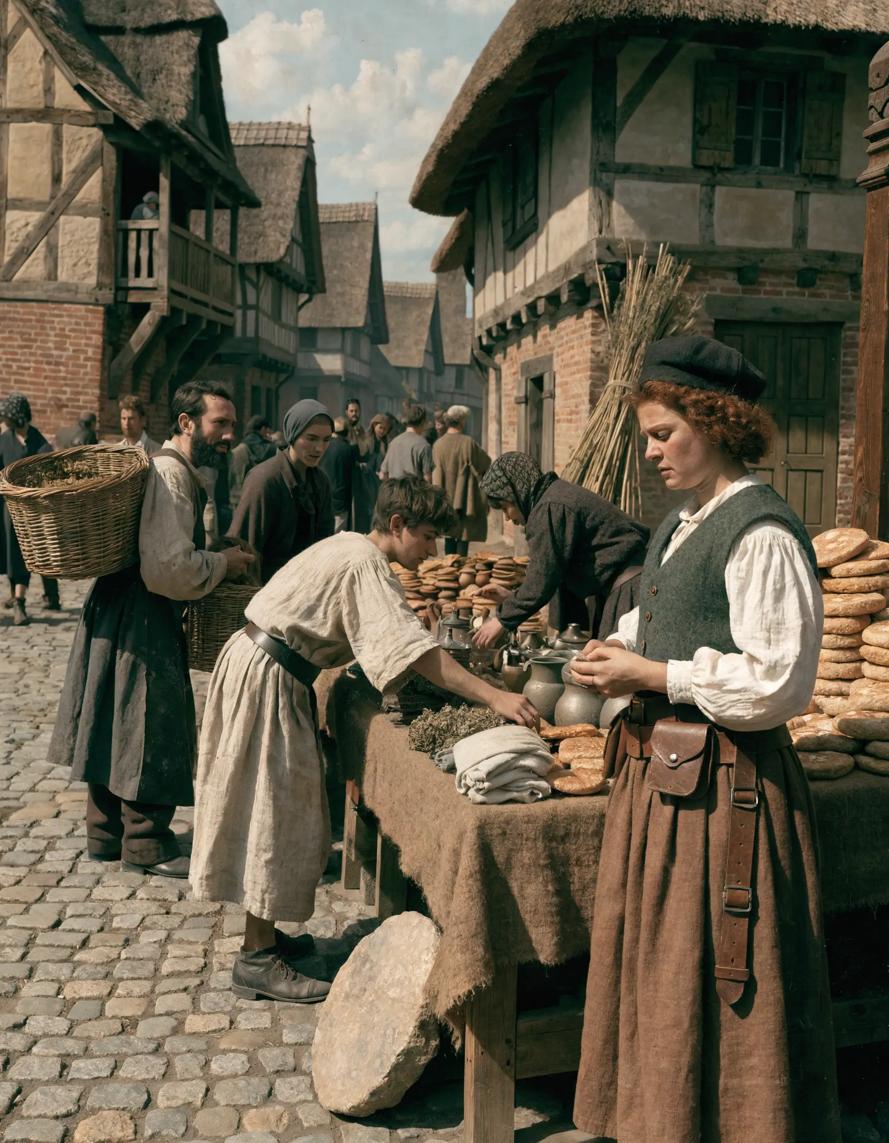
Case 6: Complex historical fantasy scene
Recraft V4 Pro
ImagineArt 2.0
.webp)
PROMPT
Medieval market scene
A good test for how each model handles a crowd.
Recraft V4.1 zoomed in and found a story. There's a woman at the corner of a bread stall at the center of the frame, and the scene is built around her. Other figures move in and out of the background, the cobblestones are textured and real, and the light feels like an overcast northern European morning. It reads like a film still. Someone is the main character, and you know immediately who.
ImagineArt 2.0 went wide and epic. A full market square, a castle in the background, dozens of figures, stalls packed with produce, a fountain at the center. It's a world-building image. No single subject anchors it, but that's not the point. The point is scale, and it delivers it convincingly.
Verdict: Different compositional philosophies, both valid. Recraft V4.1 is the pick when you need narrative focus and a human anchor. ImagineArt 2.0 is the pick when you need to establish a world.
Case 7: Branding mockup
Recraft V4 Pro

ImagineArt 2.0
.webp)
PROMPT
Photorealistic lifestyle mockup of a plain white shopping bag standing on a wooden cafe table next to a plain white takeaway coffee cup held by a human hand. Both the bag and the cup have completely blank matte white surfaces with no text, no logos, no illustrations, and no graphic elements. Smooth clean paper materials with minimal texture, realistic soft folds, subtle shadows, and premium printable surfaces. Cozy cafe interior background, warm cinematic indoor lighting, editorial product photography aesthetic, modern minimalist bakery and coffee branding mockup style.
A long, specific prompt with one non-negotiable requirement: blank surfaces, ready to brand. Both models got it right.
Recraft V4.1 went warmer and more editorial. The darker wood table, the bokeh cafe background, and the hand holding the cup at a natural angle makes it all feel like a real lifestyle shoot. The bag has a handle style that reads more premium retail.
ImagineArt 2.0 is slightly lighter and cleaner, with a simpler bag silhouette and a brighter overall mood. Both surfaces are blank and print-ready.
Verdict: Another genuine tie that comes down to brand fit. Recraft V4.1 suits a warmer, more editorial brand aesthetic. ImagineArt 2.0 suits something brighter and more minimal. Either is mockup-ready straight out of the prompt.
Case 8: Product mockup
Recraft V4 Pro

ImagineArt 2.0

PROMPT
Laptop on desk blank mockup
This is where controlled, predictable output matters more than creative interpretation, and both models deliver. The screens are clean and blank, the compositions are usable, and either could slot straight into a presentation or landing page.
Recraft V4.1 went warmer. There's a light wood desk, a small plant, soft diffused light from the side. It feels like a home office.
ImagineArt 2.0 went cooler and more architectural, with dramatic window shadow geometry across the wall and a darker, more considered surface.
Verdict: This one genuinely comes down to aesthetic preference and context. Recraft V4.1 fits a warmer, lifestyle-forward brand. ImagineArt 2.0 fits something more minimal and premium. Run whichever matches your brand's temperature.
Conclusion
Eight prompts. Two models. You decide.
Recraft V4.1 is the model with a point of view. It brings art direction, compositional instinct, and the kind of creative judgment that turns a sparse prompt into something that looks considered. When the brief has creative range, it runs with it. When the output needs to feel like it was art-directed, it delivers. Text rendering is solid, main character focus is strong, and the aesthetic consistency across output types is hard to match.
ImagineArt 2.0 is the model that prioritizes photographic truth. Its realism is genuine, its skin rendering is detailed, and when the brief calls for something that needs to feel like a real photograph, it gets there. It also handles large, complex scenes with impressive spatial coherence.
The honest answer is that these two models are not competing for the same job. Recraft V4.1 is built for work that needs a creative sensibility. ImagineArt 2.0 is built for work that needs to feel real. Knowing which one to reach for depends entirely on what you're making.
Try both at recraft.ai and see which one fits your workflow.
.svg)