Every AI image model claims to be the photorealistic one, the artistic one, the one built for professionals. That claim is easy to make and hard to check. So we ran the same eight briefs through Recraft V4.1 and Krea 2 Large: chrome surfaces, character work, mascots, product shots, a wordmark, jewelry, and a data dashboard. No cherry-picking, no rerolls. First good-faith output from each.
TL;DR: Krea 2 Large is genuinely strong on photographic texture and film-like surfaces, which tracks with its positioning as a photorealism-first model. Recraft V4.1 pulled ahead on character work, typography, vectors, and anywhere a brief needed a specific point of view rather than a plausible photo. Neither model won everything.
A chrome surface up close
Recraft V4.1 Pro
.webp)
Krea 2

PROMPT
Photorealistic product photography of a blank crinkled metallic silver pouch leaning against a plain white wall with a sharp black diagonal shadow on the floor, completely clean surface with no label or text, dramatic hard side lighting creating strong highlights on the foil texture, eye-level angle, clean minimal editorial style.
Metallic, reflective surfaces are a known stress test for image models: they reveal warped reflections and mushy specular highlights fast. Both models handled the chrome-and-foil brief without falling apart. Krea 2 Large's photoreal training shows here, the surface has the kind of raw, slightly imperfect sheen you'd expect from a real product photograph. Recraft V4.1's version leaned more sculptural, a composed shape rather than a documented object. Different goals, both legitimate depending on whether the brief wants "photograph" or "artwork."
A character with a point of view
Recraft V4.1 Pro
Krea 2
PROMPT
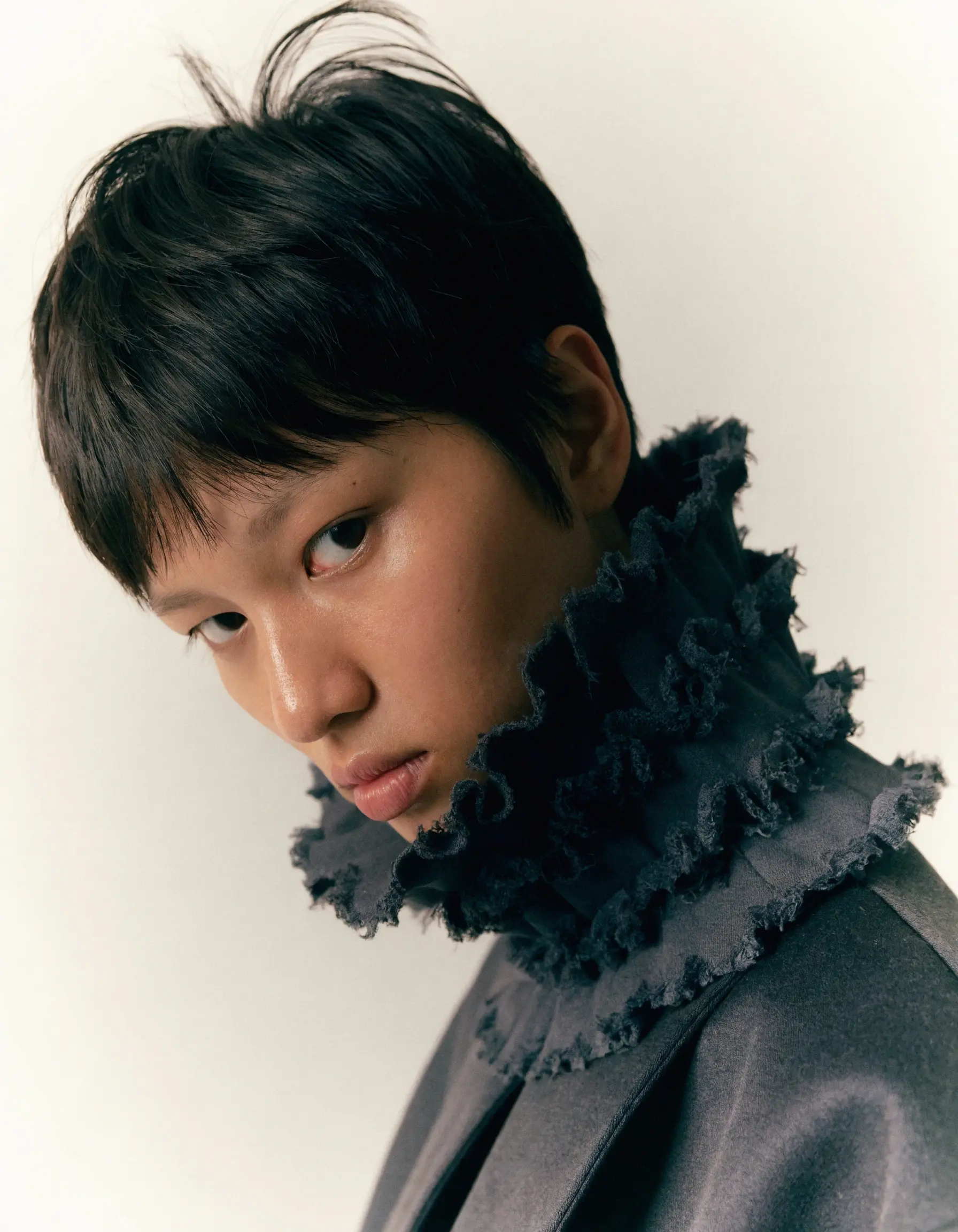
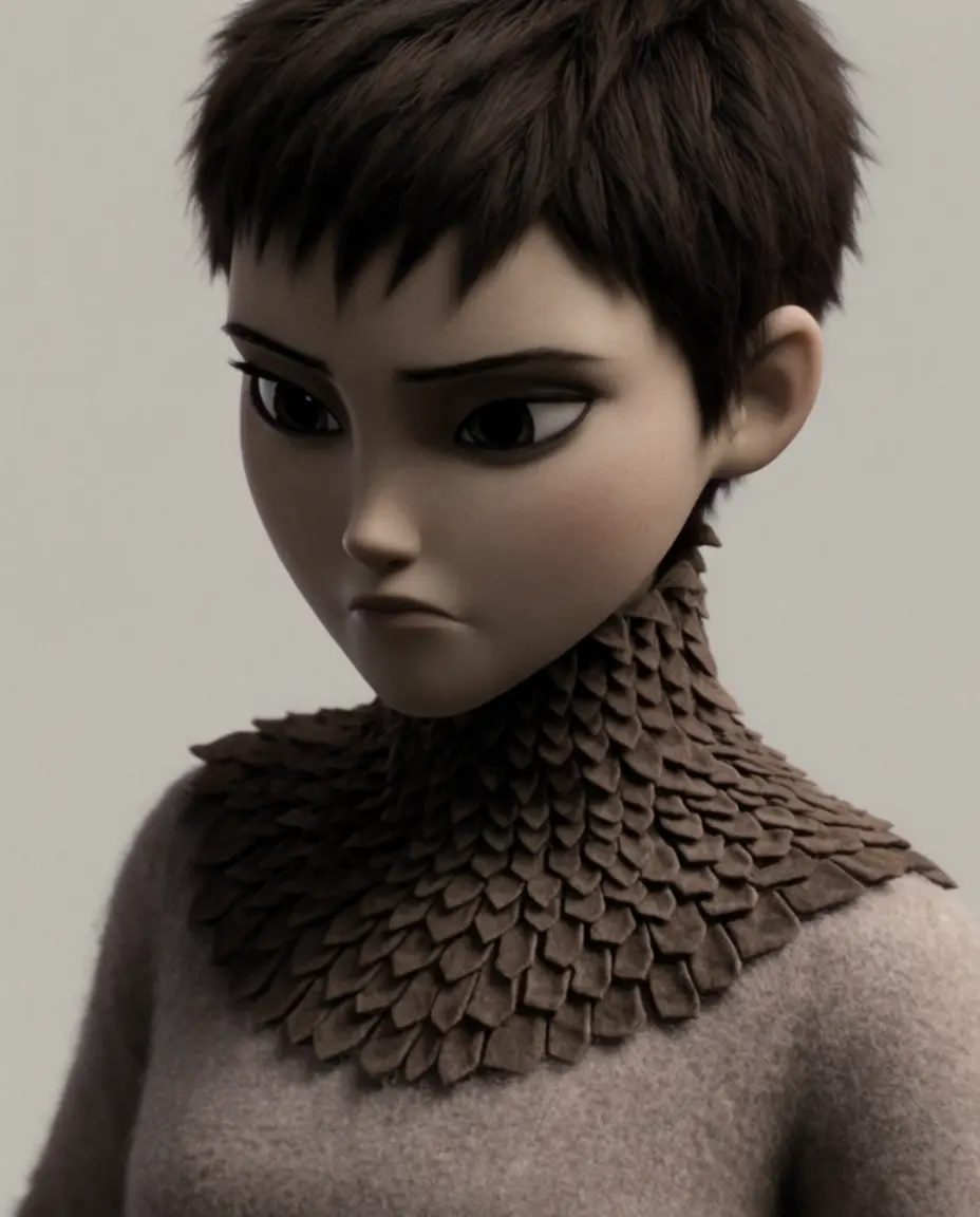
A teenage girl with very short pixie cut and large dark eyes, wearing a coat where the collar is made of dense layered fabric that rises almost to her ears, chin tucked down, expression of quiet defiance, plain background
Character portraits are where a lot of models default to the same face: symmetric, generic, forgettable. Recraft V4.1's portrait had more specific styling choices, texture in the hair, an unusual collar treatment, details that make the character feel designed rather than sampled. Krea 2 Large's version was competent but read closer to a stock character than an art-directed one. This is the category where distinctiveness matters most, and it's the category where the gap was clearest.
A mascot with personality
Recraft V4.1 Pro
Krea 2
PROMPT
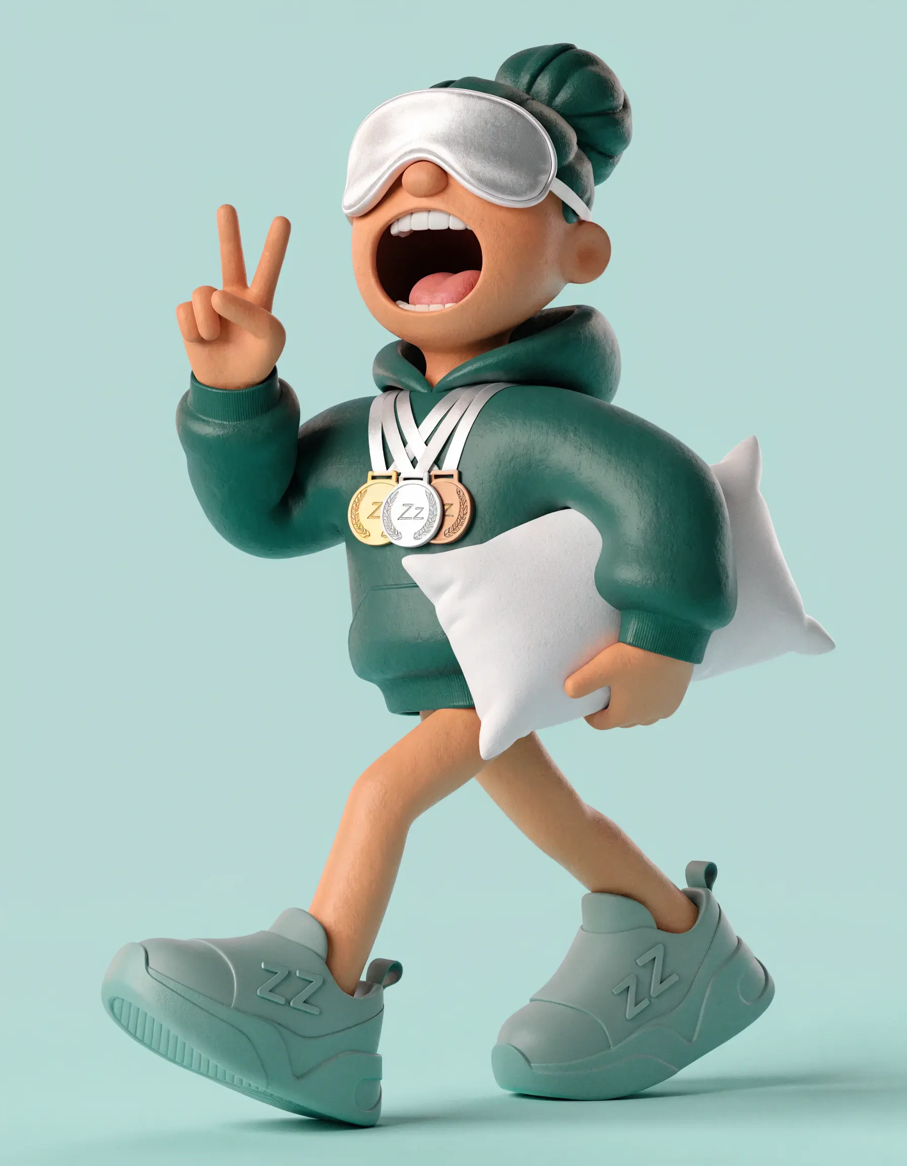
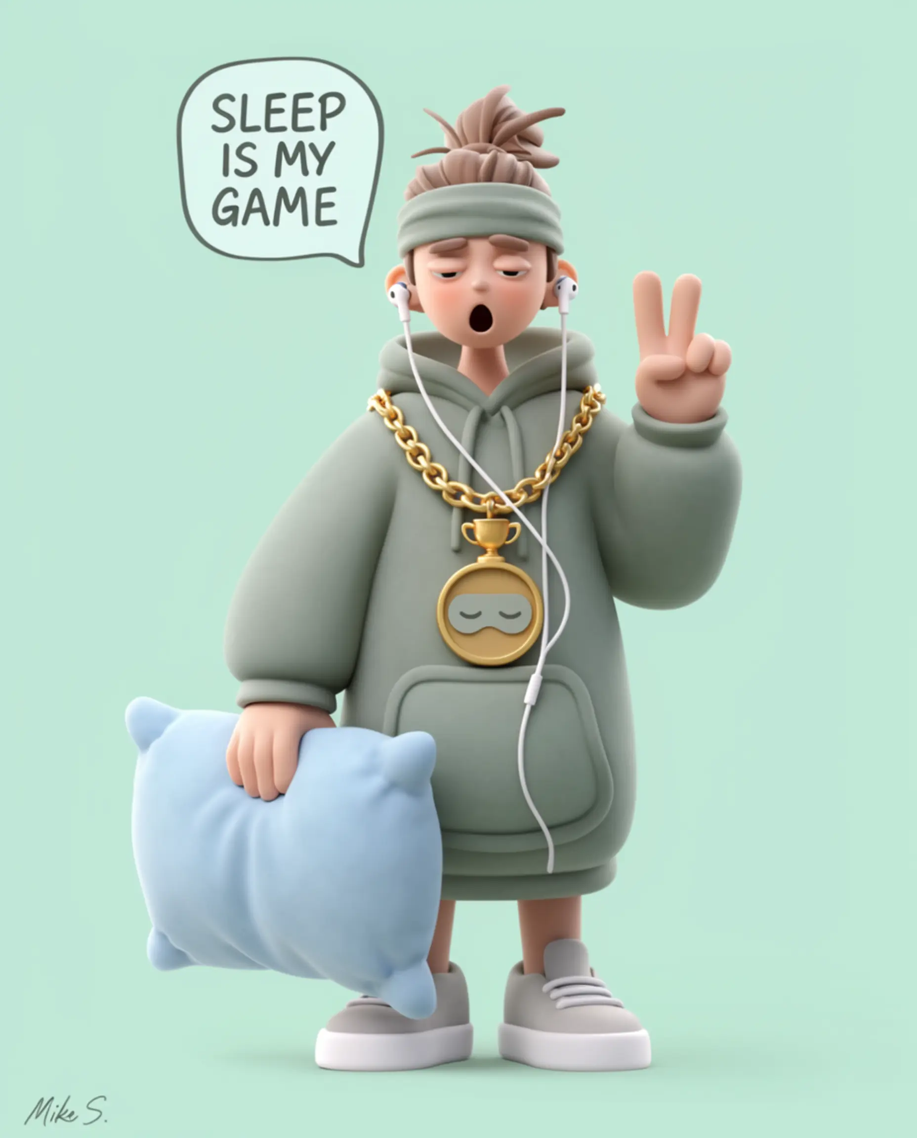
Character illustration, crisp 3D render style, Pixar quality, smooth clay-like surfaces, soft studio lighting, zero texture. A professional competitive napper — sleeps at sanctioned international tournaments, currently ranked in the top ten globally. Wearing an oversized hoodie in deep dusty sage, silk sleep mask pushed up on forehead like sunglasses, championship medals around neck, a pillow tucked under one arm like a clutch bag. Hair: perfect messy bun. Currently mid-yawn but making it look incredibly cool, one hand raised in a peace sign, eyes half closed. Proportions: soft and round, radiating effortless comfort. Sneakers: extremely clean, very limited edition. Expression: the specific unbothered energy of someone who has turned sleeping into a career and has zero regrets. Background: flat soft mint, perfectly smooth.
Same story with the 3D mascot brief. Both models rendered a clean, well-lit character. The difference was in commitment to a personality: Recraft V4.1's mascot had a specific pose and outfit that felt like it belonged to a brand. Krea's version was pleasant but more neutral, the kind of mascot that could belong to any brand rather than one.
An illustration for a product story
Recraft V4.1 Pro
.webp)
Krea 2

PROMPT
Flat vector character with laptop, floating interface windows, charts, colorful startup illustration style
Flat illustration is a category where "looks like AI" and "looks like stock art" are the two failure modes to avoid. Both outputs here were usable. Recraft V4.1's composition had more intentional color grouping and a clearer visual hierarchy, guiding the eye through the scene instead of scattering it. Krea's version was solid but closer to generic corporate stock illustration, which is a fair critique of a lot of AI-generated illustration industry-wide, not just this one output.
A product shot with color to spare
Recraft V4.1 Pro
.webp)
Krea 2
PROMPT
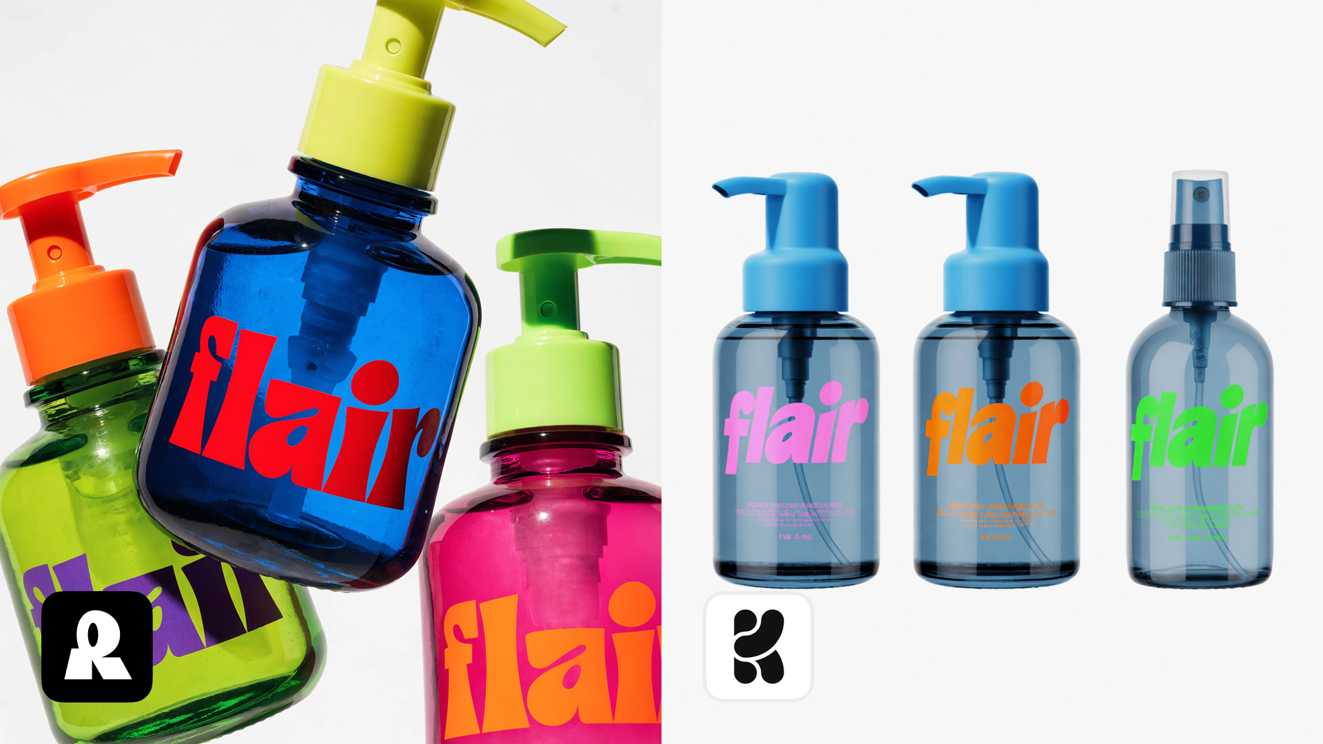
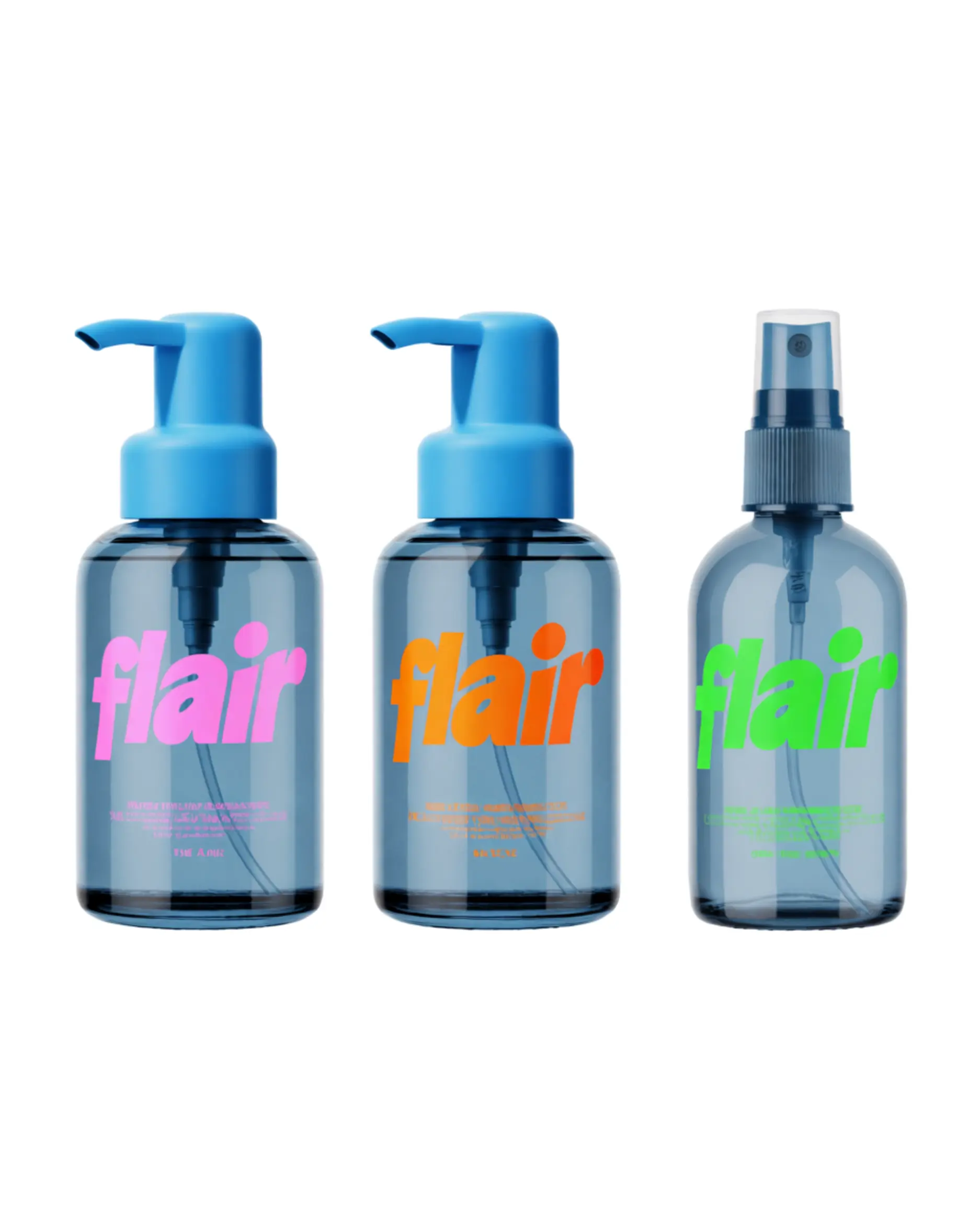
bottles for a haircare company called flair, these cool coloured glas bottles with a chunky pum and bold colored logo writing, gen z coded
Product photography with saturated color and lettering on the packaging is a genuinely hard combination: models often blur small text or muddy adjacent colors. Recraft V4.1 held composition, color separation, and label lettering more cleanly across the set. Krea 2 Large's bottles were fine on shape and reflection but softer on the lettering, which matters if the brief is a real product shot rather than a mood image.
A wordmark under pressure
Recraft V4.1 Pro
.webp)
Krea 2
PROMPT
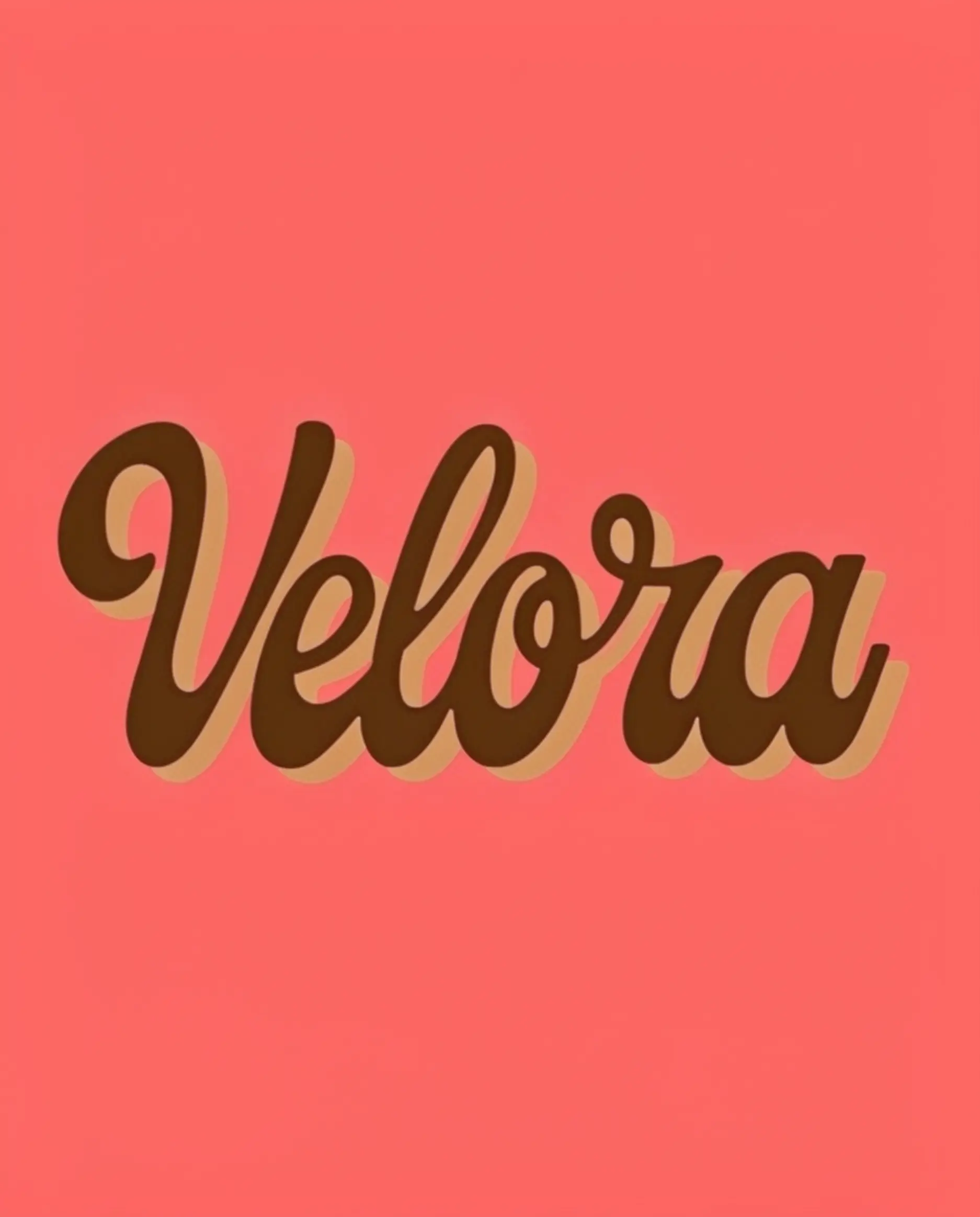
Retro vintage script logo spelling “Velora”, smooth flowing letters with thick strokes and deep offset shadow creating bold dimensional look. Solid coral background, no texture, no extra elements
Typography in-image is a lane where Ideogram usually gets credit, and it's worth noting neither of these two set the bar here. Both models rendered the "Velora" wordmark legibly. Krea's version had a glossier, more plastic finish. Recraft's felt slightly more considered as a piece of type design, but this was the closest matchup of the eight.
Jewelry that reads as real
Recraft V4.1 Pro
Krea 2
.webp)
PROMPT
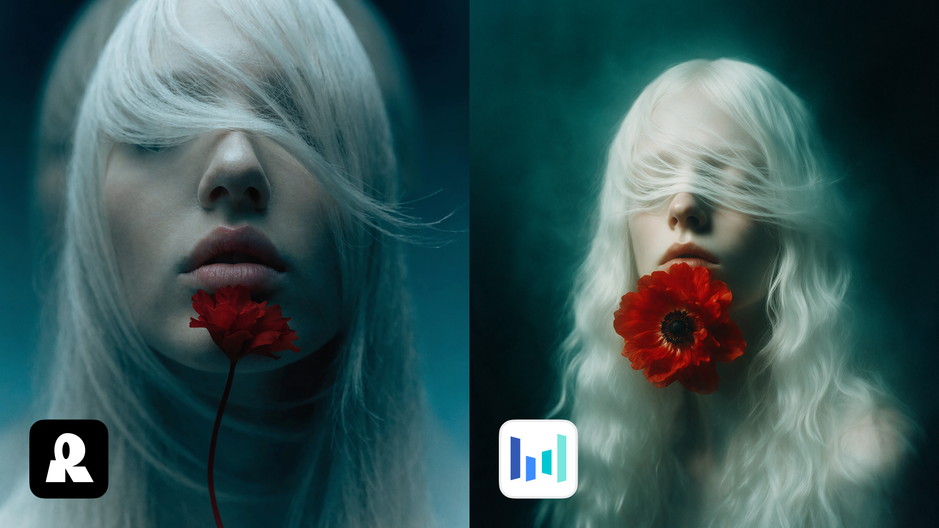
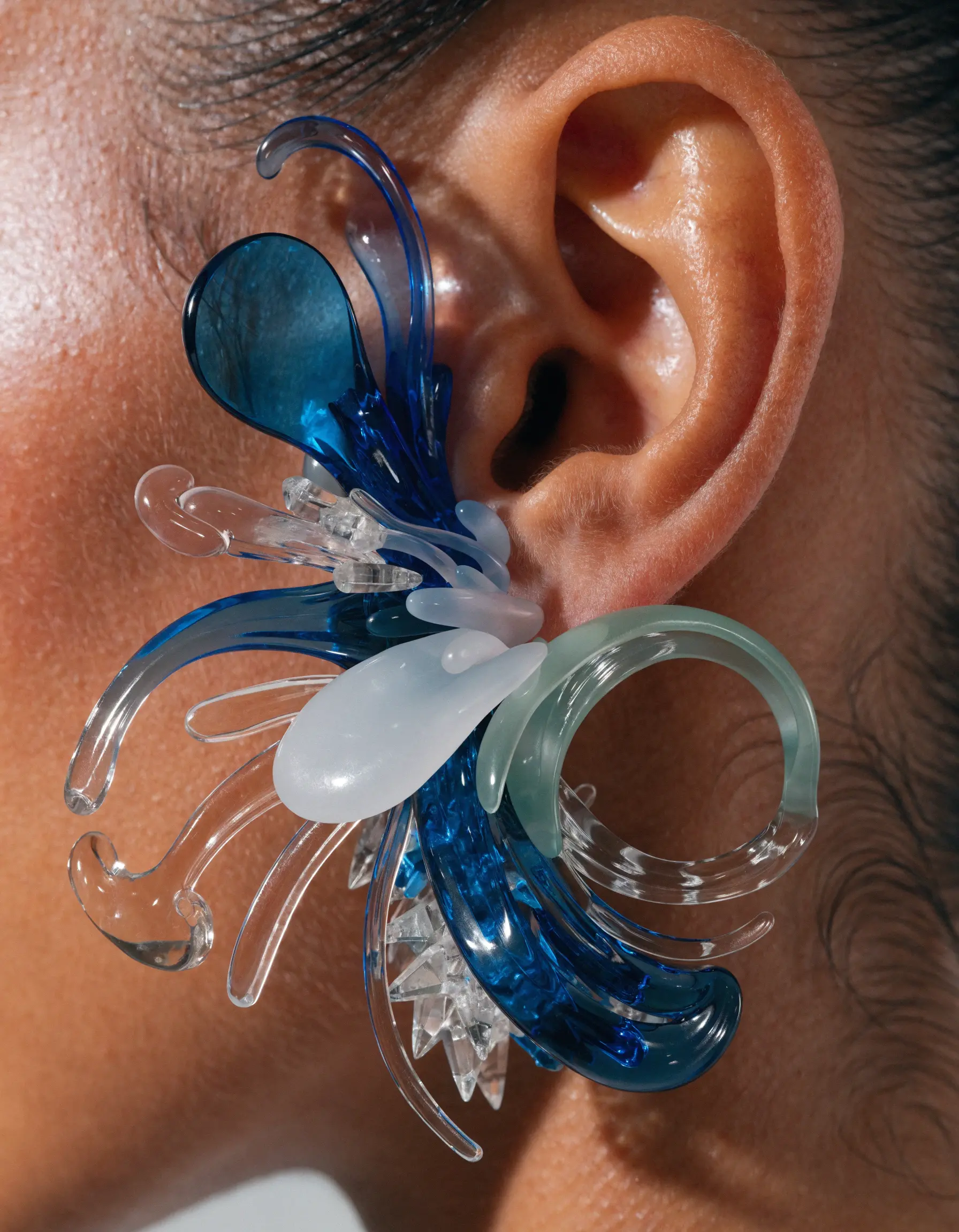
Extreme close-up of a single oversized sculptural earring worn on the ear. Made from translucent and opaque molded plastic, the earring features biomorphic forms inspired by deep-sea flora and microscopic marine structures rather than recognizable flowers. Inflated petals, flowing tentacle-like extensions, curling filaments, layered translucent membranes, and crystalline protrusions merge into a fluid organic composition. Palette: transparent cobalt, milky white, pale jade, and clear resin. High-gloss finish, futuristic Gen Z fashion, premium designer jewelry, macro beauty editorial, soft studio lighting, hyper-realistic skin texture.
Small, intricate objects like jewelry are unforgiving: any softness or plastic sheen reads immediately as fake. This was Krea 2 Large's weaker showing in the set, the piece came through with visible blur and a synthetic, overly smooth surface. Recraft V4.1's version held sharper detail and more convincing material behavior, closer to a real macro photograph than a render. Given Krea's strength is supposed to be photoreal texture, this was a genuine surprise.
A dashboard built from vectors
Recraft V4.1 Pro
Krea 2
.webp)
PROMPT
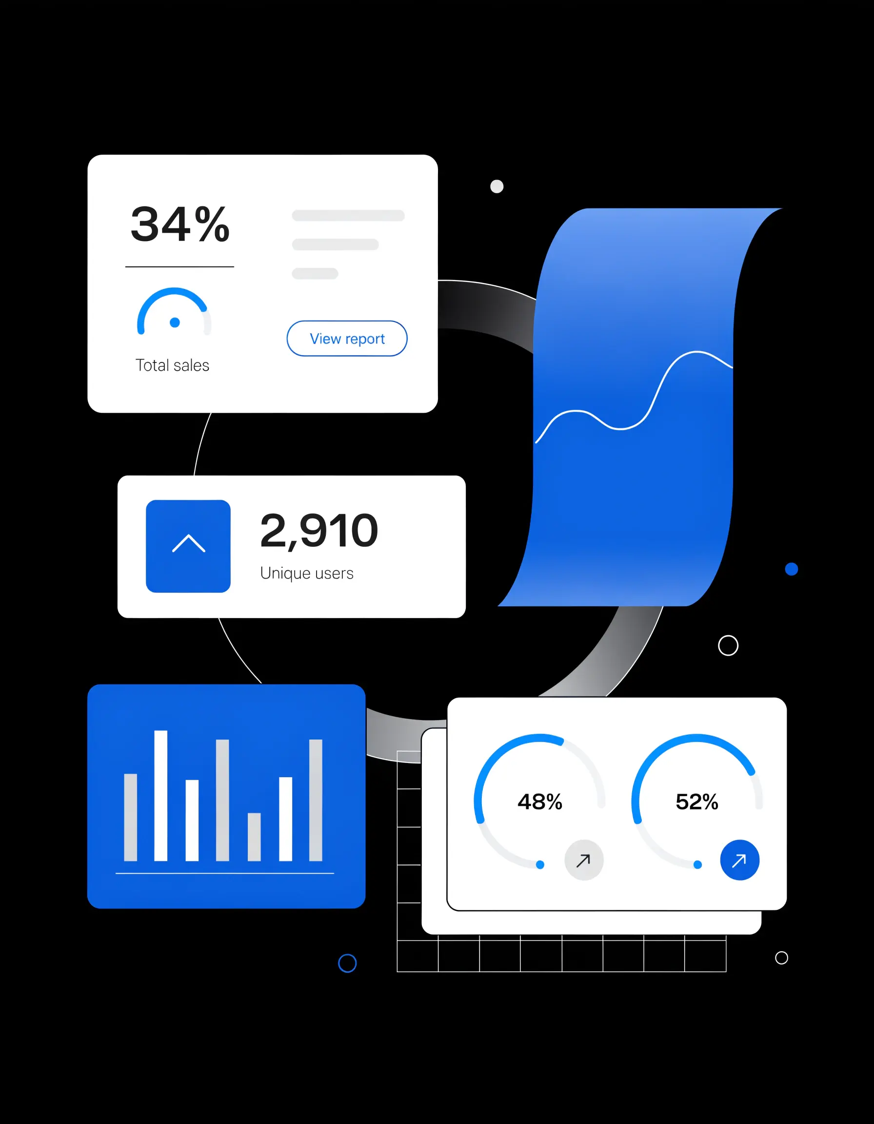
Minimal infographic vector dashboard with floating charts, graphs, statistic cards, clean SaaS interface aesthetic, futuristic UI design
Data visualization and UI-style graphics need clean geometry, aligned elements, and legible numbers, not painterly interpretation. Recraft V4.1's dashboard held straighter lines, better-aligned chart elements, and cleaner iconography. Krea's version was closer to an illustration of a dashboard than a dashboard, looser edges, less grid discipline. This category rewards precision over mood, and precision is what showed up.
The pattern
Across eight briefs, Krea 2 Large earned its reputation for photographic surfaces and raw, film-like texture, and it's a legitimate choice when the goal is "make this look shot, not made." Recraft V4.1 pulled ahead everywhere a brief needed a specific creative decision held consistently: character design, typography, vector precision, and composition with intentional hierarchy. The two models are not solving the same problem, and testing them side by side is more useful than picking a winner.
Try V4.1 free at recraft.ai.
.svg)